
CSS Buttons Animation with Awesome Hover Effect Using HTML & CSS
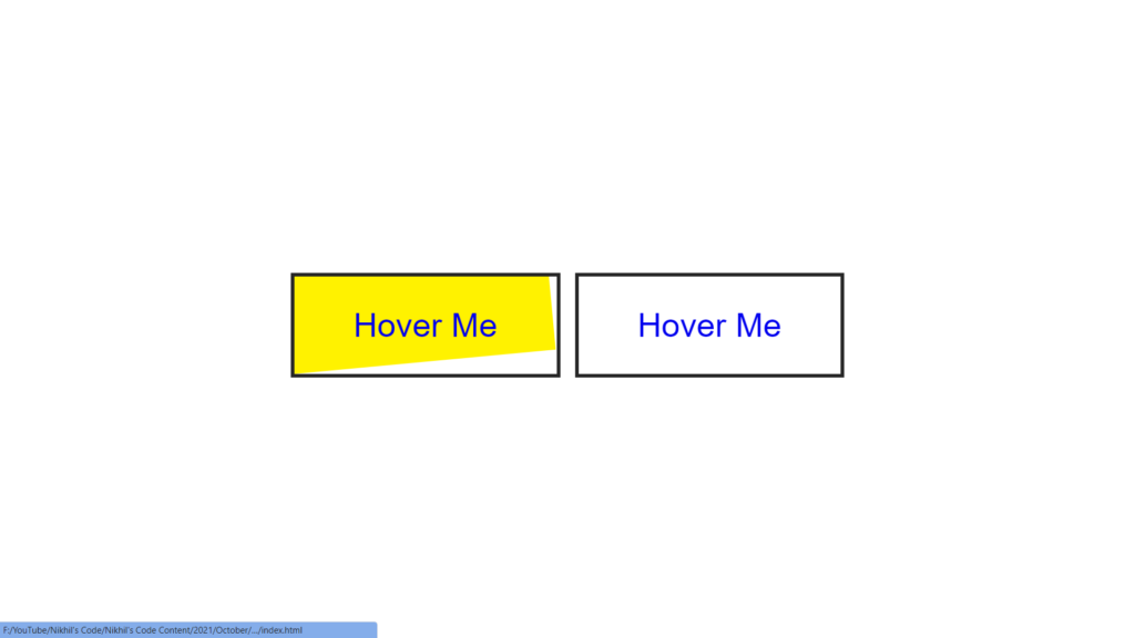
Hello Readers!, This code is a simple example of how to use CSS to create a button animation. The HTML portion of the code creates two links with the text “Hover Me” on them. The CSS portion of the code styles these links to look like buttons and adds an animation effect when the user hovers over them.
The body of the HTML document is given a display of flex, which centers the links on the page. The links are given a margin, text-decoration, font-family, font-size, border, and padding to make them look like buttons. An ::before pseudo-element is add to each link and given a background color of #fff200. The ::before element is positione absolutely and given a z-index of -1, which places it behind the link text. The transform property is use to rotate the ::before element by -90 degrees, creating a hidden effect before the hover.
When the user hovers over a link, the ::before element’s transform property changes to rotate(0deg) which makes it visible and creates the animation effect.
Video Tutorial of CSS Buttons Animation
To see a live demonstration of the CSS Buttons Animation, Click Here. For a complete video guide on how the generator works, check out the accompanying YouTube video.
You might like this:
CSS Buttons Animation
HTML Part:
Create a new file with the name “index.html” and add the provide code to it. Ensure the file has a “.html” extension.
<!DOCTYPE html>
<html lang="en">

<head>
    <meta charset="UTF-8">
    <meta http-equiv="X-UA-Compatible" content="IE=edge">
    <meta name="viewport" content="width=device-width, initial-scale=1.0">
    <link rel="stylesheet" href="style.css">
    <title>CSS Buttons Animation</title>
</head>

<body>
    <a href="#">Hover Me</a>
    <a href="#">Hover Me</a>
</body>

</html>
The body section of this HTML code includes two anchor tags, each with the text “Hover Me” that will serve as buttons for the webpage. The main purpose of the body section is to structure the webpage and hold all the content that will be display on the webpage.
In this case, the body section includes two buttons which can be used to perform different actions or link to different pages. The buttons can be styled and animated using CSS to create a visually appealing and interactive webpage.
It’s worth noting that in this code, the title of the webpage was moved after the link of the CSS file, this is because the title is not as important as the link to the CSS file, which is what styles the webpage.
In summary, The body section of this code holds the content of the webpage, in this case, two buttons. The buttons can be style and animated using CSS to create an interactive and visually appealing webpage.
CSS Part:
Create a new CSS file name “style.css” and copy the provide code into it. Ensure that the file has a “.css” extension.
body{
    display: flex;
    justify-content: center;
    align-items: center;
    overflow: hidden;
    min-height: 100vh;
}
a{
    position: relative;
    margin: 10px;
    text-decoration: none;
    font-family: sans-serif;
    font-size: 45px;
    border: 5px solid #262626;
    padding: 40px 80px;
    overflow: hidden;
}
a::before{
    content: '';
    position: absolute;
    left: 0;
    top: 0;
    background: #fff200;
    height: 100%;
    width: 100%;
    z-index: -1;
    transform-origin: bottom left;
    transform: rotate(-90deg);
    transition: transform 1s;
}
a:hover::before{
    transform: rotate(0deg);
}
One specific CSS property in this code is the “transform-origin” property of the ::before pseudo-element of the anchor tag. This property is use to “bottom left” which specifies the position of the element, in this case the ::before pseudo-element, from where the transformation is applie. In this case, the transform-origin is use to the bottom left corner of the element so that when the rotation transformation is applie, the rotation happens from the bottom left corner.
Summary:
This code is a simple example of how to use CSS to create a button animation. The HTML portion of the code creates two links with the text “Hover Me” on them. The CSS portion of the code styles these links to look like buttons and adds an animation effect when the user hovers over them by changing the transform property of ::before element.