Rain Animation Effects using HTML & CSS
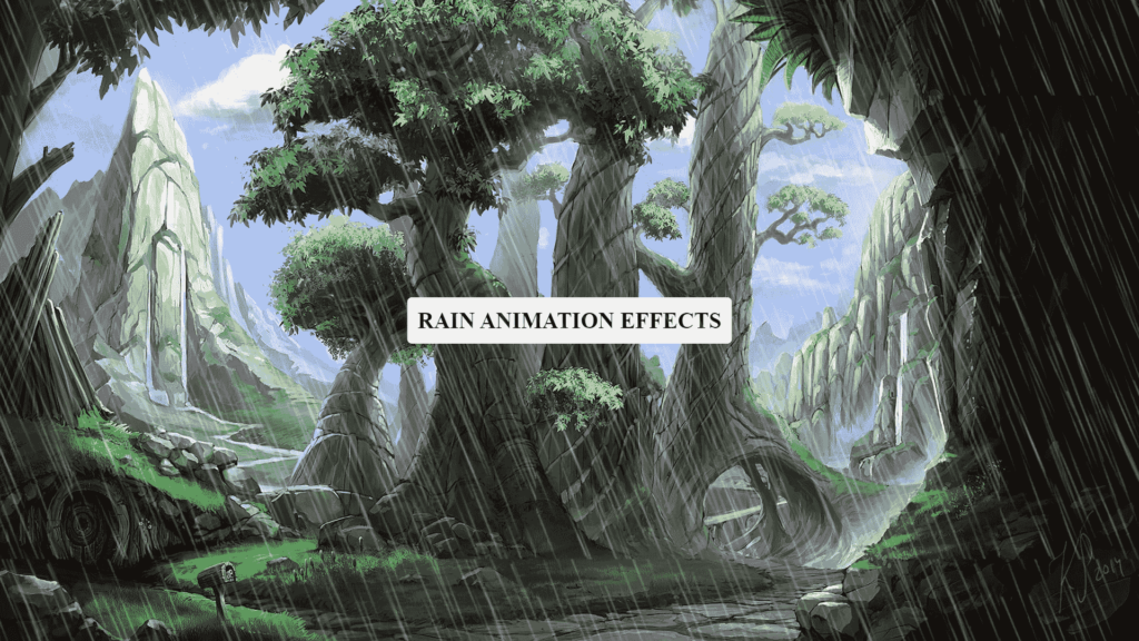
In this blog, This code demonstrates an animation of rain effect using HTML and CSS. The rain effect is achieved by using the ::after pseudo-element and keyframe animation. The animation is applied to the header element, and the rain effect is created by using a background image of rain. Additionally, there is a background image of a nature scene and a filter effect of hue-rotation animation applied to the header element to give the illusion of changing weather.
The text “Rain Animation Effects” is displayed on the center of the page using a div element with the class “text” which is positioned absolutely and transformed to be centered on the page. Overall, this code effectively creates a realistic animation of rain falling over a nature scene.
Video Tutorial of Rain Animation Effects
To see a live demonstration of the Floating Text Animation, Click Here. For a complete video guide on how the generator works, check out the accompanying YouTube video.
Rain Animation
HTML Part:
Create a new file with the name “index.html” and add the provide code to it. Ensure the file has a “.html” extension.
<!DOCTYPE html>
<html lang="en">

<head>
    <meta charset="UTF-8">
    <meta http-equiv="X-UA-Compatible" content="IE=edge">
    <meta name="viewport" content="width=device-width, initial-scale=1.0">
    <link rel="stylesheet" href="style.css">
    <title>Rain Animation Effects Using HTML and CSS</title>
</head>

<body>
    <header>
        <div class="text">
            <h3>Rain Animation Effects</h3>
        </div>
    </header>
</body>

</html>
In this blog post, we will be discussing how to create a beautiful rain animation effect using HTML and CSS. The first thing we need to do is set up our HTML document.
We begin by defining the DOCTYPE as html and specifying the language as “en”. Next, we have the head section of our HTML document where we set the character set to UTF-8, specify that our document is compatible with IE=edge and set the viewport to have a width of device-width and an initial-scale of 1.0.
We also include a link to our stylesheet, “style.css”, in this section. The title of our document is set to “Rain Animation Effects Using HTML and CSS”.
Moving on to the body section of our HTML document, we have a header element that contains a div with a class of “text”. Inside this div, we have an h3 heading with the text “Rain Animation Effects”.
The next step would be to create the CSS styles for our rain animation effect. We can control the speed, direction, and appearance of the raindrops using CSS properties such as animation and @keyframes.
In conclusion, by using HTML and CSS, we can create a visually stunning rain animation effect for our web pages. With a little bit of creativity and some CSS coding, the possibilities are endless.
CSS Part:
Create a new CSS file name “style.css” and copy the provide code into it. Ensure that the file has a “.css” extension.
* {
    margin: 0;
    padding: 0;
    box-sizing: content-box;
}

header {
    position: relative;
    width: 100%;
    height: 100vh;
    background: url(bg.jpg);
    background-size: cover;
    animation: animate 2s linear infinite;
}

@keyframes animate {
    0% {
        filter: hue-rotate(0deg);
    }

    100% {
        filter: hue-rotate(360deg);
    }
}

header::after {
    content: '';
    position: absolute;
    top: 0;
    left: 0;
    width: 100%;
    height: 100%;
    background: url(rain.png);
    animation: rain 0.2s linear infinite;
}

@keyframes rain {
    0% {
        background-position: 0 0;
    }

    100% {
        background-position: 20% 100%;
    }
}

header .text {
    position: absolute;
    top: 50%;
    left: 50%;
    width: 350px;
    height: 50px;
    background: #fff;
    display: flex;
    justify-content: center;
    align-items: center;
    transform: translate(-50%, -50%);
    border-radius: 5px;
}

header .text h3 {
    color: #000000;
    font-size: 1.5em;
    text-transform: uppercase;
    letter-spacing: 0.2px;
    font-weight: 700;
}
The first CSS rule is setting the margin and padding to 0 and the box-sizing to content-box for all elements on the page.
The next rule targets the header element and sets its position to relative, width to 100%, and height to 100vh. It also sets the background image to “bg.jpg” and uses the “background-size” property to cover the entire element. It also uses the “animation” property to animate the “animate” keyframe over 2 seconds in a linear fashion and infinitely.
The “@keyframes animate” rule sets two keyframes, one at 0% and one at 100%, which change the hue-rotation from 0deg to 360deg, creating a smooth hue rotation effect.
The “header::after” rule creates a pseudo-element that is positioned absolutely and covers the entire header element. It sets a background image of “rain.png” and uses the “animation” property to animate the “rain” keyframe over 0.2 seconds in a linear fashion and infinitely.
The “@keyframes rain” rule sets two keyframes, one at 0% and one at 100%, which change the background-position of the rain image from 0 0 to 20% 100%, creating the animation of rain falling.
The next rule targets the “header .text” element, and sets its position to absolute, top and left to 50% and transform property to translate(-50%, -50%) to center it. It also sets a width and height, background color, display property to flex and justify-content and align-items properties to center.
The last rule targets “header .text h3” element, and sets its color, font-size, text-transform, letter-spacing and font-weight properties.
Summary:
This code create an HTML document with a header that contains a heading “Rain Animation Effects” and a background image that is cover by a rain animation effect. The rain animation is create using CSS, with the use of keyframes and animation properties. The background image also rotates its hue using keyframes, creating a dynamic visual effect. Additionally, the code resets the default margins and padding for all elements and sets the box-sizing to content-box.


